Everyone knows Census.gov has a wealth of information, but once you’ve mastered the download process you have a giant mass of data on your computer. Some data tables have more than 750 columns!
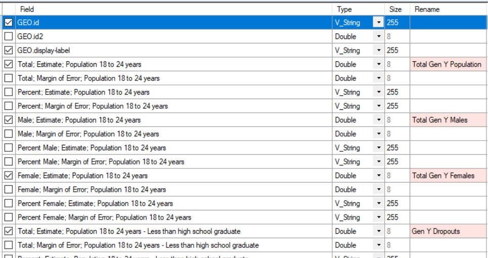
Understanding such tables is a challenge with so many fields. With Excel, you could manually highlight and delete the hundreds of columns that are off-topic. In Alteryx, its simple Select tool can start off with no columns allowed through, and with a few clicks you pick just the 10 or 20 that you need for your analysis. In addition, the original column headers can be replaced with shorter, more informative labels. “Achieved less than High School diploma” can become “H.S. Dropout” in your version of the data.

This is convenient, but not the main reason Alteryx is such an advance over plodding through the manual deletion process in Excel.
As you go deeper into the selected data, you may realize that you actually need some of the fields that you blocked. With Excel, assuming you preserved the original pre-deletion data, you now would need to copy the needed columns from the original and carefully paste them into the correct places in the trimmed data set. As with any manual process, mistakes can be made.
By contrast, with the Alteryx Select tool, it’s a simple matter of checking a few boxes to let the needed additional fields flow into the analysis. (Alteryx always leaves the original data untouched, including the original column names.) Again, a nice advantage over Excel but not Earth shattering.
Now for some real magic
Census data usually shows up with data broken into categories-by-column. For example, in a table tracking the number of people with college degrees in a geographic area, you’ll see the data broken into five columns by age group: 18 to 24, 25 to 34, and so on through to 65-plus. What if you wanted to bring this data into Tableau to create a very simple line chart, with age groups on the horizontal axis and number of degree holders on the vertical axis? You need two columns of data, one for age and one for number of degree holders. These two columns do not exist in the original data.
Alteryx has a Transpose tool that reads the five column headers (age) and puts all of them into a single new column. Each age group is a new row. Then it reads the data (the number of degree holders) under each column header and puts them into a second new column — matched to the age rows. With these two new columns created for each jurisdiction in your Census data, you can create Tableau charts for each of those jurisdictions.
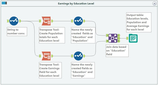
In the image below, the Select tool we used earlier to trim down and rename data is first used to do some string-to-numeric conversions in the Census data. Then the first Transpose tool creates rows where education levels are matched to the population in each level. The second Transpose tool creates the same identical rows for education level, but matched to the average earnings for each education level. Then the Join tool glues the two data streams together based on education level, creating a table with five education level rows, and two data columns – the population and the earnings for each education level.

This illustrates a key strength of Alteryx: its ability to automatically re-arrange data into the format needed for analysis. Data may have inherent challenges, such as Census entries that are spread across multiple columns, or it simply may not match the format of another data set that you need to include. Alteryx squeezes and stretches and trims data sets with user-set rules that can repeat the same way every time. In addition to being far faster than manual reshaping, it’s far more reliable and self-documenting: each change to the data is shown in the visual workflow. You don’t have to remember what you did last time to prep the data, or trust someone else to have done it correctly by hand. The workflow image shows each and every time the data has been put through an evolution.
With complex data sets from outside your organization, like the Census, having Alteryx available makes Tableau analyses far easier.


