
Food Banks
Analytics can help food banks get their most out of their volunteers’ efforts, maximize food and cash donations, and better target distribution efforts.
Using free Census data, Precision Analytics Group provided one Bay Area food bank with maps showing the most impoverished areas, as well as those areas with the highest concentrations of older residents. Census data also can create maps of “extreme” poverty (those receiving less than half the poverty income level) and by race/ethnicity.
Overlaid on the maps were circles representing easy walking distance from each distribution center, so that poor or elderly pockets without such access were easily identified.
Another food bank keeps records of home addresses for the people they serve. Precision Analytics Group used Alteryx to plot these home addresses on a poverty map for the Portland area. Since many people can drive to food bank locations, this is an alternative metric to walking distances. In the map on the lower right, two areas of high poverty do not have any people showing up at the distributions. The food bank could open new distribution points or increase its outreach efforts in the unserved areas. Read our blog post to learn more: Mapping the Poverty Gaps.
Contact us and let us know how we can help you with your data!
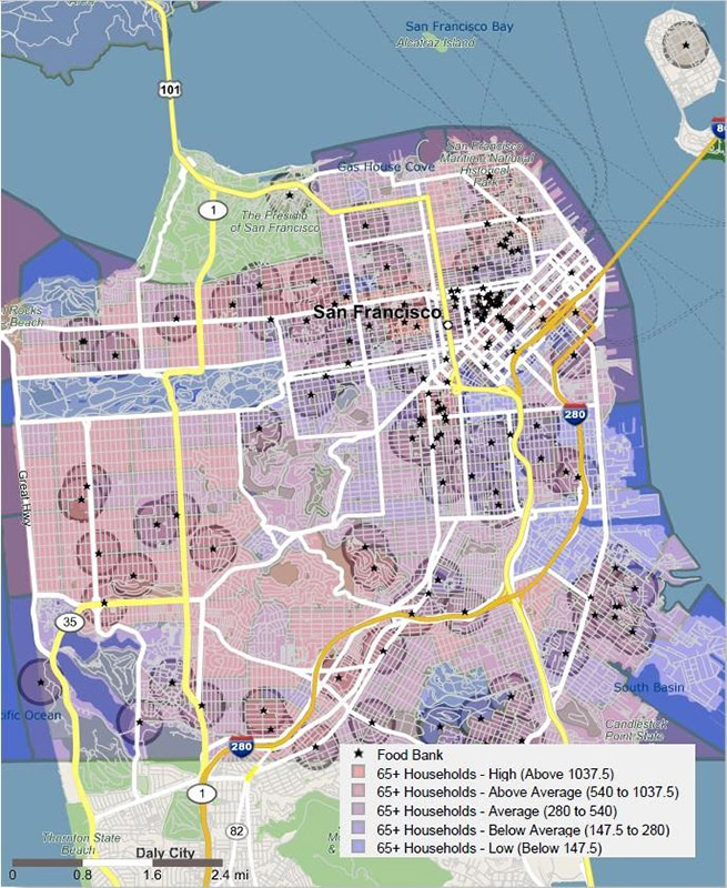
Poverty Map, Bay Area. (Click to enlarge.)
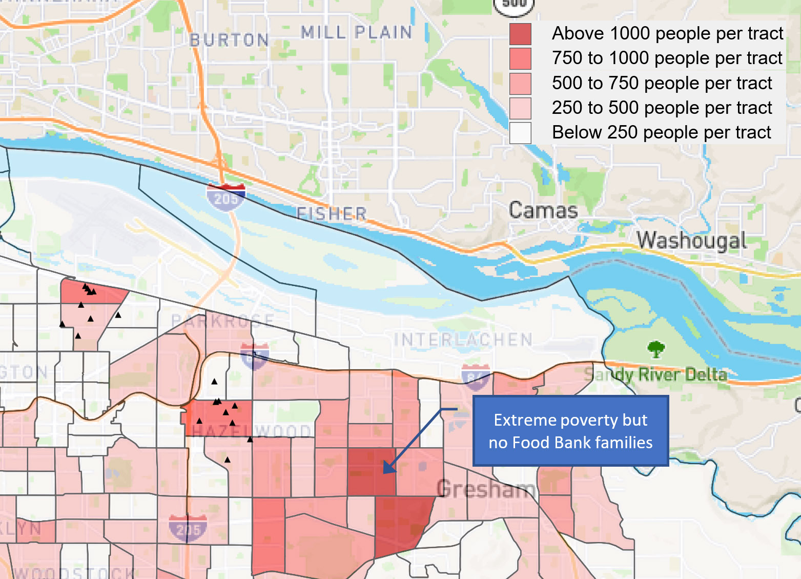
Poverty Map, Portland. (Click to enlarge.)