Food banks across the country are helping their hungry neighbors get through the pandemic, stretching their small budgets with volunteer labor. Precision Analytics Group is helping some food banks use the built-in mapping capabilities of Alteryx to get an affordable look at the gaps in their service. They do this by overlaying the addresses of the people they’ve served on to maps of high-poverty areas in their service region, and seeing where there are high-poverty pockets without anyone having been served by the food bank.
State-by-state data on poverty is free from the www.census.gov/programs-surveys/acs site. Alteryx quickly reformats the data, such as pulling apart a compound identifier like “Census Tract 49, Multnomah County, Oregon” into its individual parts.
Census data uses very long field names, such as:
Estimate!!Below poverty level!!Population for whom poverty status is determined!!RACE AND HISPANIC OR LATINO ORIGIN!!Asian alone
For display on tables and maps, Alteryx can shorten this gigantic name to “Asian Poverty” so that every time you download updated information, or get data for a new area, the huge field name is converted to something manageable.
To create maps, your state’s “shapefiles” are available from www.census.gov/geographies/mapping-files/time-series/geo/tiger-line-file.html. Be sure to match up the year of the poverty data download with the year of the shapefiles. Over time, a Census tract that grows too populated will be split into two new tracts and their new shapefile tract numbers won’t exist in the older data.
Census data catalogs several levels of poverty. Tracts will show how many people fall below the official poverty threshold (which varies with household size and ages) but in 2021, it is roughly $12,800 for single-person household and $31,040 for a five-person household. Tracts also show the population in extreme poverty, with income less than 50 percent of the threshold.
These figures and the shapefile polygons can be fed into the Report Map tool. Using its default Smart Tile method, it will split the high-poverty tracts into five levels of population. The break points likely will not be round numbers. The top category might be labeled “Above 1150” and the category below that might be labeled “790 to 1150” and so on. Once you see where the exact break points are after running the workflow, you can go back to the Report Map tool and select easier-to-read “rounder” numbers, as shown in the following Manual Tile method:
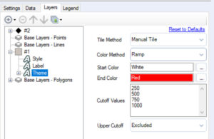
The top category is now “Above 1000” with the next as “750 to 1000” and so on, an easier-to-grasp set of break points.
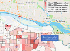
In the poverty maps that Precision Analytics Group created for Portland, Oregon, the top category had the deepest red color. Obviously, by adjusting the break points, you also adjust how many tracts on the map display the deepest shading.
The next step is feeding in the addresses of families served by the food bank. These have to be associated with their latitude and longitude. The easy way to accomplish this is having a license to the Alteryx Geocoder Macro, which automatically assigns the lat and long coordinates to addresses. The standalone Geocoder App is free and creates a file that then has to be read into Alteryx. If you just want to do a short test, you can input each address into Google Maps, and get the lat/long data that way.
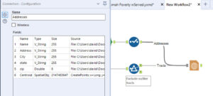
Next, connect both data sources (Census tracts and food recipient addresses) to the Report Map tool. In creating Maps and Layouts, the default Alteryx behavior is to simply label each incoming stream as #1, #2, and so on. If you end up with a dozen streams coming into a tool, keeping track of which stream delivers what data can be vexing, especially in Layouts where you are trying to determine which ones should come first in the Layout order. By clicking on the line, you can rename the line in the Configuration window:
The Report Map has four tabs that are fairly easy to experiment with, but the Layers tab can be a problem. Sometimes, the various data sources will show up here without intervention. More often, you will need to click on the circled Plus button:
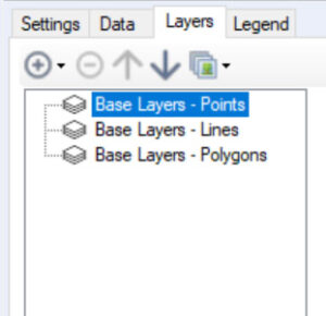
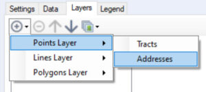
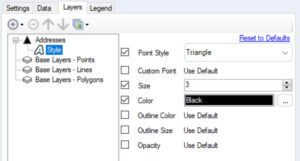
Now the Addresses incoming data line will be visible in the Layers tab, and be modifiable:
The result of combining the extreme poverty tract maps with the triangle points for families already served is a map showing where families are not being served – where there are few or no triangles, but areas of extreme poverty. This indicates where the food bank needs to increase its outreach efforts, or where new distribution points need to be established to serve hungry people who don’t have easy transportation to the existing sites.
In the example below, for privacy protection purposes, the addresses are only hypothetical, not actual food bank recipients.