This month is dedicated to spatial analytics and how it can really enhance the results of a particular analytic question that an organization is trying to answer. Let us begin by first defining spatial analysis. Spatial analysis is the mathematical and statistical analysis of geographic locations. GIS (geographic information systems) transform text strings like “456 Maple Street, Yourtown, CA” into a latitude and longitude marker on a map. This builds a model of the physical world to enable things like predicting the weather, identifying patterns, delineating crises and pandemics, and analyzing data variations by their physical locations. Many governments and companies heavily use spatial analysis for finding the “ideal places” to locate new stores or aid points for needy populations. Outcomes are shown as maps with graphs or statistics.
Now we have laid the foundation for what spatial analysis is, it is time to discuss demographic analysis. Statistics that characterize populations and their traits are known as demographics. The study of a population based on characteristics like age, race, and sex is known as demographic analysis. Socioeconomic information expressed statistically, such as employment, education, income, marriage rates, birth and death rates, and more, also is referred to as demographic data.
Demographics are essential in advertising for developing focused marketing strategies that appeal to consumer groups. One company may advertise to lower-class and middle-class people with families because most of their consumers are comprised of these families. Through analyzing their data, the company understands their strongest demographic sources of revenue. Conversely, another company may prioritize childless individuals’ consumers with college degrees, full-time jobs, and higher incomes based on analysis of its data.
Demographic analysis and spatial analysis can be used individually to tell a compelling story to answer an analytical question. However, it’s more powerful to combine these concepts and create a more complete answer to an analytical question utilizing data from a multitude of factors. I have a use case to share with you that will put both concepts on display.
The Use Case
My company faced putting together a prototype for a customer who represented a Latino grocery store chain. They were interested in targeting store expansion in the Las Vegas metropolitan area. They wanted us to show them areas with the highest concentrations of Latino households with incomes of at least $35,000. This was a hypothesis that the customer wanted us to evaluate. We are going to talk about how we did it.
First, we combined Census data containing race and income data by census tract. Then, we joined the demographic data with the spatial objects of each Census tract. Additionally, we added another layer of spatial data to the mix by plotting the current locations of Latino grocery stores in the Las Vegas area. So, we have two sets of spatial objects: the Census tract polygons and the spatial point of the store locations. The number of Latino Households in Las Vegas earning over $35,000 would be associated by Census tract. The process is displayed in the image below.
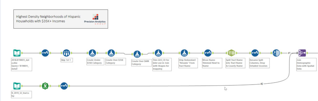
We took the output of this Alteryx workflow and pushed it to a .hyper file so that we could create visualizations in Tableau. Sometimes, people want to pit Tableau and Alteryx against each other. I look at Alteryx as a mandatory Swiss Army knife that makes all these visualization tools like Power BI, Tableau, and IBM Cognos even better. Alteryx does all the metadata work that would slow down the performance in these other tools. We used Alteryx to set up the data so that all Tableau must do is display it.
Enter Tableau
We have the .hyper file in the Tableau workbook. We are ready to start plotting our dimensions and measures. What we wanted to do was create a map visualization with multiple to tell the story. Here we go.
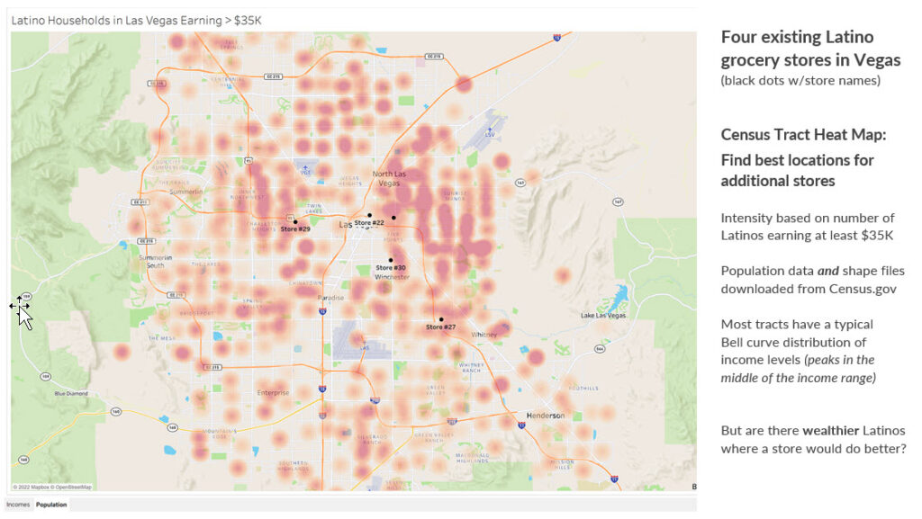
We used a heat map to show the density of the Latino households making over $35K by census tract. You can also see that the black dots on the map represent the existing supermarkets in Las Vegas. This will give you a solid visualization which parts of Las Vegas have an abundant population of higher-earning Latino households and how close they may be to existing Latino supermarket. As you highlight the reds and oranges on the map, we also provide the end user with a complete income breakdown of Latino households in that census tract by supply a micro chart in the tooltip for the map.
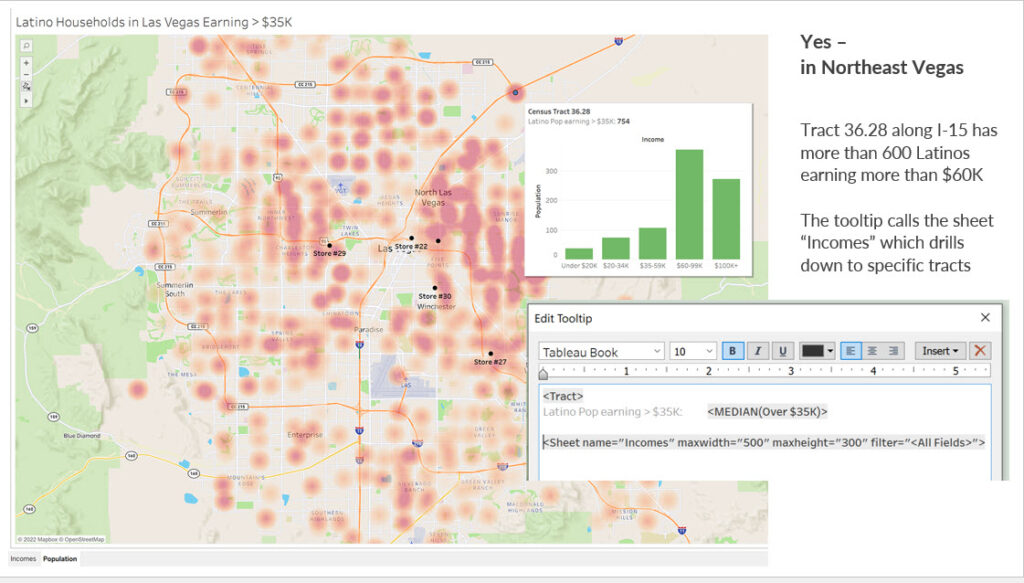
We created another worksheet that was comprised of a bar chart quantifying the income buckets and population of Latino families with the Census and other fields passed into filters. The code above enables the developer to have full control of the size of the micro chart to be display once the rollover occurs.
What Can We Deduce from this Visualization
We accomplished the goal of displaying where the higher income of Latino households are in the Las Vegas area. We can also see where they are in respect to the existing supermarkets. Additionally, we can assess the drivetime from Census tracts to those markets. We can also determine where potential areas are to investigate building new supermarkets. The lower left quadrant of Las Vegas could be a spot to investigate, in addition to the upper right with the especially high-income Latino Census tracts. Keep in mind that this visualization is not the end of your analysis for store expansion. It really begins the next detailed phase of analysis.
We would recommend first selecting a handful of areas based on this visualization and examine the following questions. How expensive is the real estate in these areas? Are there competitor stores in that area? If so, how well are they doing revenue-wise? You might want to examine the crime rate in these areas to see if opening a store might create a loss because of theft and other negative events. Another thing to examine would be traffic volume in these areas. If traffic is low, you might not get the shoppers needed to sustain a new store. All these factors and others would need to be evaluated before pulling the trigger on new expansion.
Conclusion
It is all about using every ounce of data available to you to drive a business initiative such as store expansion. I just illustrated how combining demographic analysis with spatial analysis can create visual representation of what you might need to do next. Will this combination sometimes lead a company to a direct action to take? Yes. Will it be the last action in the journey for an analytic question? No, because this analysis will focus your next set of questions so you can gain an even clearer direction on what to do next. For this particular use case, the journey continues. We are talking about spending millions of dollars to potentially expand. You want to gather as much data about crime, traffic, and real estate prices so that the best new store sites can be chosen. Knowledge is power and analytics is your power source.
By Chris Williams
Certified Alteryx Partner
and Tableau Desktop Specialist