Power BI is a powerful business analytics tool that allows users to visualize and analyze data from various sources. One of the key features of Power BI is the ability to create dashboards, which can provide an at-a-glance view of critical data and metrics. There are some basic fundamentals that can apply to putting together any dashboard. However, in this blog we will discuss how to build effective dashboards in Power BI, including best practices for data visualization and design.
Plan your Dashboard
Before you start building your dashboard, it is essential to plan out the content and structure of your dashboard. This means identifying the data sources you want to use, defining the key metrics you want to track, and selecting the appropriate visualization types to display the data. One of the best visual tools to use to plan a dashboard’s look and feel is a tool called Miro. Miro is an online collaborative whiteboard platform that allows teams to work together and share ideas in real-time. It is a popular tool for remote teams, as it provides a virtual space where members can collaborate and brainstorm, no matter where they are in the world.
In the above screen capture, I used Miro to develop a quick prototype of how a dashboard could look like for my client. This did not require any knowledge of developing in Power BI, but just a whiteboard. It helps when agreeing on color schemes and look-and-feel.
Connect to Data Sources
Once you have identified the data sources, the next step is to connect them to Power BI. Power BI supports a wide range of data sources, including Excel spreadsheets, SQL Server databases, and cloud-based services like Salesforce and Google Analytics. Alteryx has a Power BI connector. This means that any dataset derived from an Alteryx workflow can be pushed directly into Power BI as part of the workflow functionality.
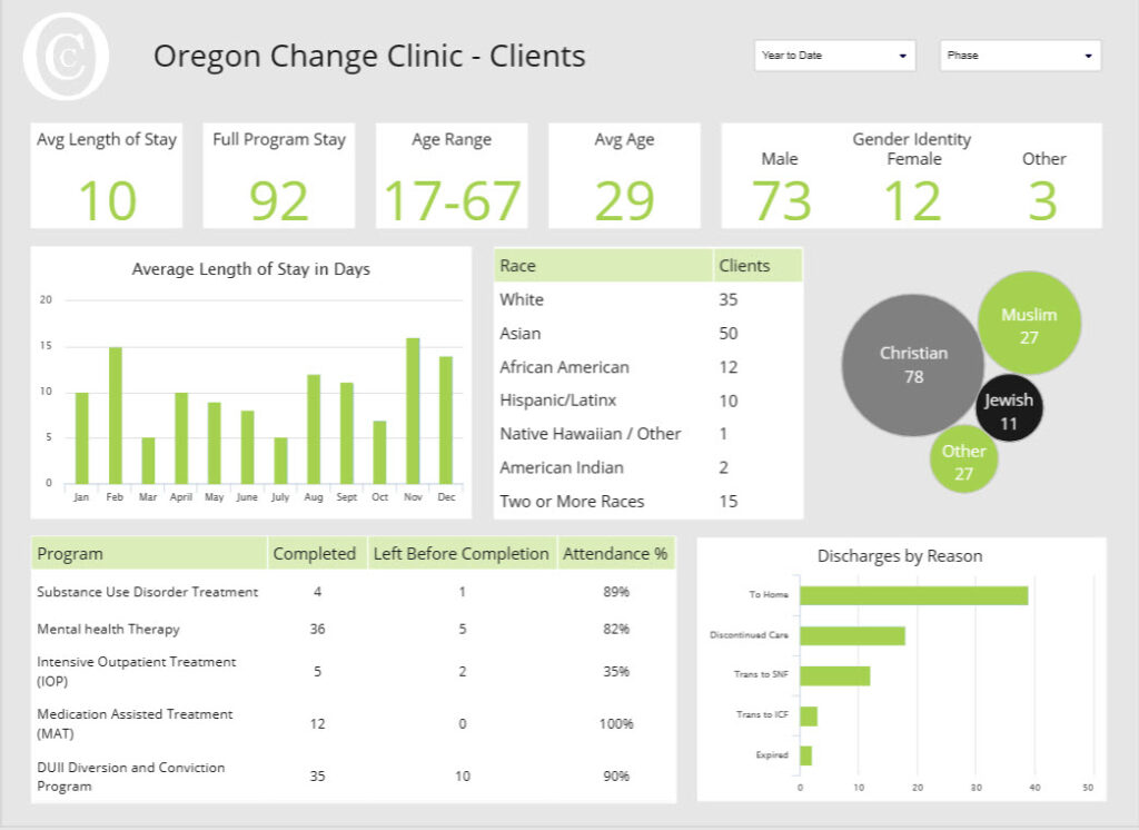
Create a report
Before you can create a dashboard, you will need to create a report that contains the visualizations you want to display. The report is essentially a canvas where you can add various visuals, such as charts, tables, and maps.
Add visuals to your report
To add a visual to your report, simply drag and drop the data fields you want to use onto the canvas. Power BI will automatically create the appropriate visualization based on the data type.
Customize your visuals
Once you have added your visuals, you can customize them to suit your needs. Power BI provides a wide range of formatting options, including color schemes, font styles, and chart types. You can also add filters, drill-down capabilities, and other interactive features to make your visuals more engaging.

Here is a super example of how one can spice up a simple dashboard with a tremendous background image. This public dashboard created by aokenu shows with the right color scheme, a background image can make the other visualizations “pop” thus bringing more attention to it.
Create a dashboard
Once you have created your report, you can turn it into a dashboard by pinning specific visuals to a dashboard canvas. To do this, simply select the visual you want to pin, click the “Pin” button, and choose the dashboard you want to add it to.
Arrange your visuals
Once you have pinned your visuals to the dashboard canvas, you can arrange them to create a logical flow of information. This might involve grouping related visuals together, adding text boxes to provide context, or using a background image to create a cohesive design.
Add interactivity
Power BI provides a range of interactive features that allow users to explore the data in more detail. For example, you can add slicers, which are visual filters that allow users to select specific values to display in the dashboard. You can also add drill-down capabilities, which allow users to see more detailed information by clicking on a visual.
Publish and share your dashboard
Once you have created your dashboard, you can publish it to the Power BI service and share it with others. You can also embed your dashboard in other applications, such as SharePoint or Teams, to make it more accessible to your audience.
Best practices for data visualization and design in Power BI
Data visualization is a critical part of data analysis, as it enables data analysts and business users to gain insights from large and complex data sets. Power BI is a powerful data visualization tool that allows users to create dynamic and interactive visualizations. In this blog, we will discuss some of the best practices for data visualization and design in Power BI.
Keep it Simple
One of the most important best practices for data visualization and design is to keep it simple. Avoid cluttering your visualizations with too much data or unnecessary elements. Instead, focus on presenting the key data points in a clear and concise manner.
Use Appropriate Chart Types
Choose the appropriate chart type for your data. Power BI offers a range of chart types, including bar charts, line charts, and pie charts. Each chart type has its strengths and weaknesses, so it is important to choose the right one for your data.
Use Color Effectively
Color is an important tool in data visualization, as it can be used to highlight important data points and create contrast between different elements. However, it is important to use color effectively and avoid overusing it. Use color sparingly and consistently across all of your visualizations.
Use White Space
White space is the empty space between elements in your visualization. It is important to use white space effectively to create a clean and organized visualization. Use white space to separate different elements and highlight key data points.
Provide Context
Provide context for your data by including relevant labels, titles, and axis labels. This will help your audience understand the data and its meaning.
Use Interactivity
Power BI allows you to create interactive visualizations that allow users to explore data in more detail. Use interactivity to allow users to drill down into data and explore different perspectives.
Test and Iterate
Finally, it is important to test and iterate your visualizations to ensure that they are effective. Test your visualizations with different audiences and iterate based on feedback.
Conclusion
In conclusion, data visualization and design are critical components of data analysis, and Power BI offers a range of powerful tools for creating effective visualizations. By following these best practices, you can create compelling and informative visualizations that help you gain insights from your data.
