Overview of Use Case
Educational attainment is a key indicator of a state’s human capital. It’s both an indicator of how well an education system is functioning, and the state’s ability to attract 21st Century industries with an educated workforce. Putting U.S. Census data into map form makes it easier for analysts, decision makers, and employers to see where the issues and opportunities are located.
Describe the business challenge or problem you needed to solve
Census tables are a rich source of data, with the American Community Survey conducted every year to gather more detailed information than the bare bones counts of the decennial Census every 10 years. By combining five year’s worth of annual ACS surveys, the Census Bureau can provide details down to the tract level, which usually have 4,000 or so people. An urban county can have several dozen tracts, while rural counties might have only one or two.
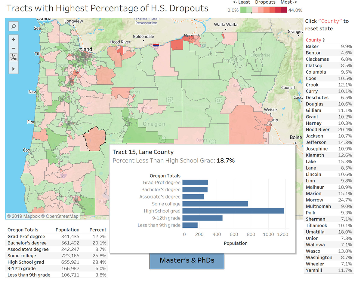
Precision Analytics Group created a dashboard that displays educational attainment down to the tract level for the state of Oregon. Buttons switch among three displays: one highlighting the problem of high school dropouts, and two showcasing those tracts with the most college grads and the most Masters and Ph.D. grads.
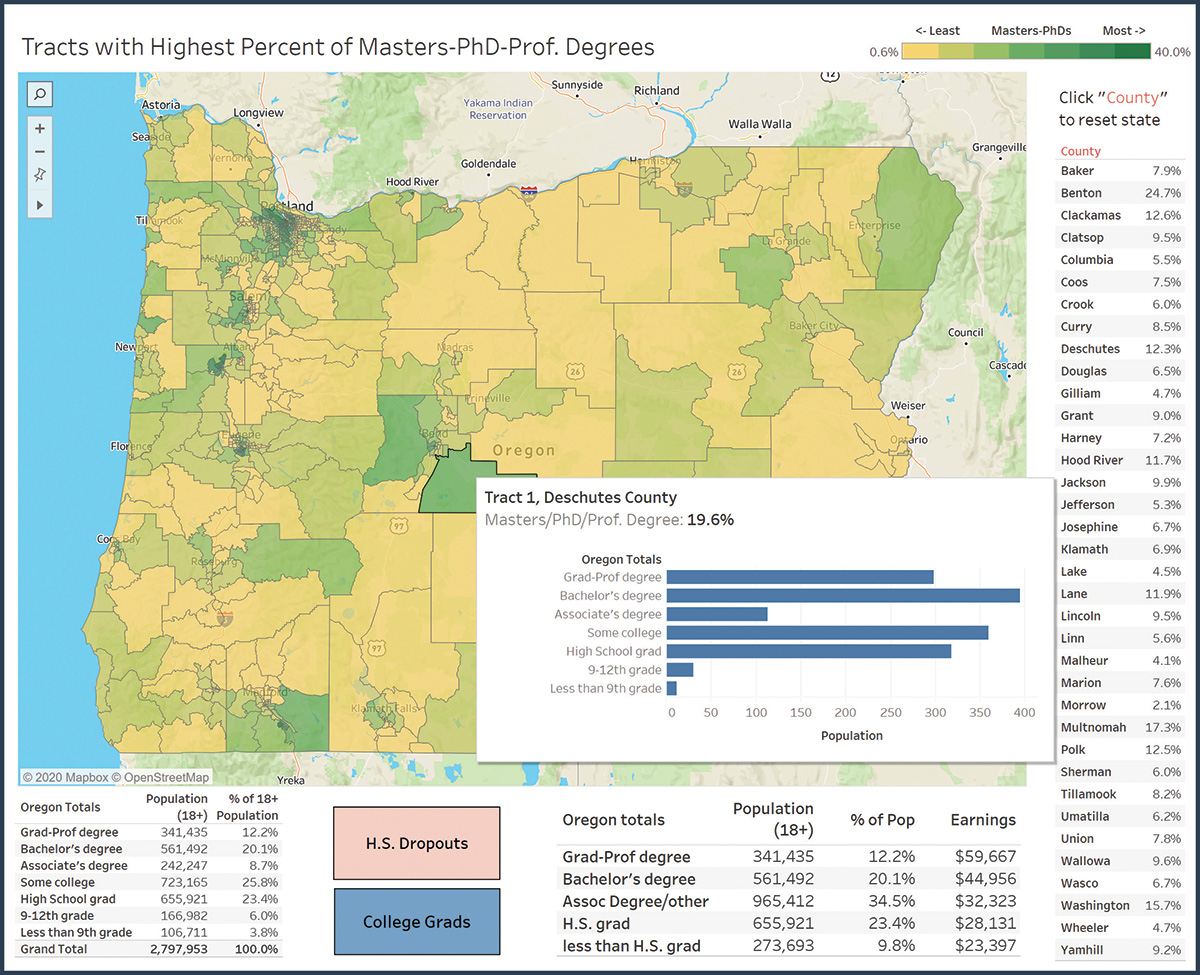
An accompanying table shows the education achieved in detail at the state level, including those who dropped out in grade school, and those who began college but did not finish. This “some college” category is Oregon’s largest, at more than 25% of the 18+ population.
Another shows the average earnings by education level. This collapses some of the education levels (due to the underlying data on earnings being less detailed).
Tooltips pop up over each tract, showing the detailed breakdown of education and the number of people in each category. Number of people, rather than percentages, was selected in order avoid extreme percentages based on few people in a tract.
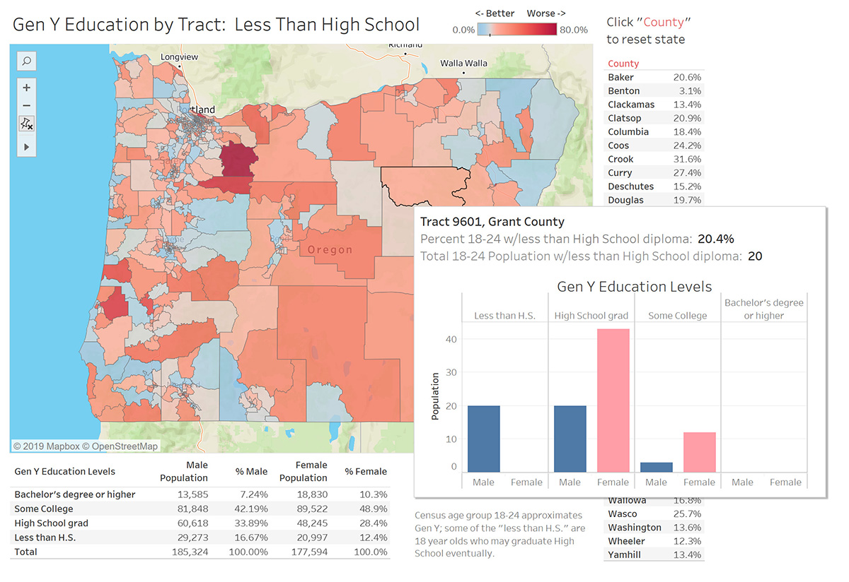
The Census data show the cumulative effect of the education system over the past 60-80 years – the status of the entire adult population. Precision Analytics Group also used Tableau to investigate more recent successes or failures of the education system, by developing visualizations of Gen Y’s educational attainment. Gen Y was approximately 18 to 24 years old when the Census data was collected, so the youngest members lacking a high school diploma might achieve one in a few months.
The GenY map shows a different pattern of high school dropouts than the all-ages map, with the reddest areas (of high dropouts) shifting to the west from the east and south. In addition, the tables reveal that men are falling substantially behind women in the education race. Some 59% of Gen Y women have advanced to attending college, compared to only 49% of the men who have gone beyond a high school education. As the Tool Tip for Tract 9601 in Grant County shows, all its 20 high school dropouts were men. Only one man had gone on to college, compared to 11 women.
Describe the benefits you have achieved
The Tableau visualizations (many more than shown here) enable Oregon’s education leadership to quickly identify outliers, both positive and negative. Potential employers also can see where the most educated portions of the state population live, to aid in siting new high-technology facilities.
Have a similar use case? Let us help you solve it!